Getting Started with the Swap Widget
This guide walks you through the steps to embed the swap widget in your website in 2 minutes — whether your site is already a decentralized application (dApp) or not. With the swap widget, your users can trade ERC-20 tokens on the Uniswap Protocol without leaving your site!
Here’s a live preview of the swap widget.
Example use cases include:
- Building a custom frontend for the Uniswap Protocol
- Swapping assets in a DeFi application
- Acquiring a token to participate in your web3 community (e.g. FWB or a gaming token)
- Converting to the required currency for an NFT purchase (e.g. WETH)
You can make the widget feel like a native part of your app by customizing the colors, font, and token list to match your app theme. This guide will teach you how.
Installing the Widgets Library
To get started, install the widgets library using npm or Yarn. If you don’t already use it, you’ll need to install react-redux as well.
npm install --save @uniswap/widgets react-redux
Adding the Swap Widget to Your App
Next, embed the React component in your application.
import { SwapWidget } from '@uniswap/widgets'
import '@uniswap/widgets/fonts.css'

function App() {
  <div className="Uniswap">
    <SwapWidget />
  </div>
}
That’s it! You should now see a fully functional swap widget on your site. The widget is self-contained and gracefully handles all interactions with the Uniswap Protocol. It leverages the Auto Router to compute the best price across all Uniswap v2 and v3 pools.
See a full implementation of the swap widget in the /cra and /nextjs branches of the widgets-demo repo.
Create React App V4
All code snippets will work seamlessly if you use Next.js or Create React App V5. However, if you’re using Create React App V4, you’ll need to use the following import statements instead:
import { SwapWidget } from '@uniswap/widgets/dist/index.js'
import '@uniswap/widgets/dist/fonts.css'
Recommended Parameters
The swap widget is a React component that can be easily imported into any React project. It's designed to work out-of-the-box, with no required parameters or web3 integration necessary. Trading is supported on all networks where the Uniswap Protocol is deployed.
Although the widget will work out-of-the-box with no parameters, we highly recommend integrators provide JSON-RPC endpoints, like from Chainnodes, Infura or Alchemy. Existing dApps can also provide their existing web3 provider to integrate the widget seamlessly into their dApp.
Additional optional parameters are available to customize the appearance and performance of the swap widget to fit your unique use case.
Web3 Provider
The swap widget uses a web3 provider prop to allow users to connect their wallets, fetch balances, and submit transactions through the user’s connected wallet.
If your app does not maintain its own web3 provider, you can omit the provider prop. The widget will use built-in wallet connection functionality (for WalletConnect and MetaMask), making it easy for you to integrate web3 in your app!
If you already have a web3 provider, you can pass your provider object directly into the provider prop. Both ethers and web3.js provider objects are compatible with the widget, as is any EIP-1193 provider.
You can directly use the providers returned from web3-react or wagmi (both are ethers providers). If it is not connected to a wallet, it will still be used to read data from the chain, but the widget will still prompt the user to "Connect wallet".
Be sure to use the wallet-connected provider
When using wagmi@v0.11, useProvider() will return the fallback provider, not the wallet-connected provider. You should instead pass useSigner<JsonRpcSigner>().data?.provider to reflect the user's connected wallet.
If you maintain a web3 provider on your app, you should also consider intercepting the swap widget's wallet connection flow. Do so by passing a handler returning false to the onConnectWalletClick prop, which is triggered when the widget's "Connect wallet" button is clicked. Check out libraries such as web3-react, BlockNative’s Onboard, or Aragon’s useWallet() to build your own flow. To hide the swap widget's wallet connection flow entirely, pass true to the hideConnectionUI prop.
The widget will match the network currently selected by the passed provider. If the user switches networks in your app or in their connected wallet, that change will propagate to the widget as well. If the user connects to a network that is not supported by the swap widget, the widget will gracefully disable itself.
import { SwapWidget } from '@uniswap/widgets'
import '@uniswap/widgets/fonts.css'

// We recommend you pass a web3 provider.
import { provider } from './your/provider'

// We recommend you pass your own JSON-RPC endpoints.
const jsonRpcUrlMap = {
  1: ['https://mainnet.infura.io/v3/<YOUR_INFURA_PROJECT_ID>'],
  3: ['https://ropsten.infura.io/v3/<YOUR_INFURA_PROJECT_ID>']
}

function App() {
  <div className="Uniswap">
    <SwapWidget provider={provider} jsonRpcUrlMap={jsonRpcUrlMap} />
  </div>
}
JSON-RPC Endpoints
JSON-RPC endpoints are used to read data when no provider is connected. We strongly recommend you pass either a Web3 Provider to the provider prop, or JSON-RPC endpoint URLs to the jsonRpcUrlMap prop.
The widget will use these endpoints to fetch on-chain data and submit transactions for signature. If the user connects a MetaMask wallet, the widget will use the JSON-RPC provided by MetaMask when possible. (See a list of all chains supported on widget.)
If you don’t yet have JSON-RPC endpoints, you can easily create them with services like Chainnodes, Infura or Alchemy.
If you choose not to provide a jsonRpcUrlMap prop or are missing endpoints for some chains, the widget uses free public JSON-RPC endpoints to still allow users to interact with the widget and fetch price quotes. However, these public endpoints are NOT recommended for production environment usage, are severely rate-limited, and aren't necessarily as reliable. When possible, we'd recommend providing your own endpoints!
Customizing the Swap Widget
You can set optional parameters to tailor the appearance and functionality of the swap widget to fit your dApp.
Customizing the Width
The swap widget has a fixed height of 360px and a default width of 360px. You cannot modify the height of the widget. You can modify the width up to a minimum width of 300px.
You can customize the width by passing a number (of pixels) or a valid CSS width to the width prop of the widget.
import { SwapWidget } from '@uniswap/widgets'
import '@uniswap/widgets/fonts.css'

function App() {
  <div className="Uniswap">
    <SwapWidget
      width={360} // Custom width in pixels
    />
  </div>
}
For example:
width={360}sets the width to 360 pixelswidth="100%"sets the width to dynamically fill 100% of the parent containerwidth="20em"sets the width to 20 * 16 = 320 pixels because 16px is the base font-size of the widget
The recommended and default width is 360 pixels.
Customizing the Theme
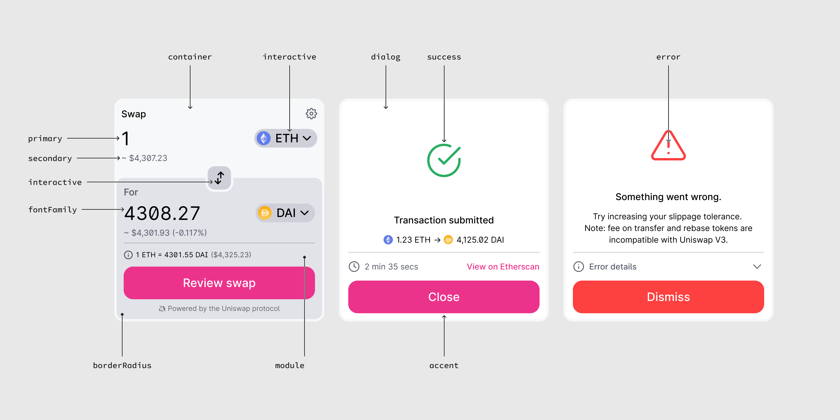
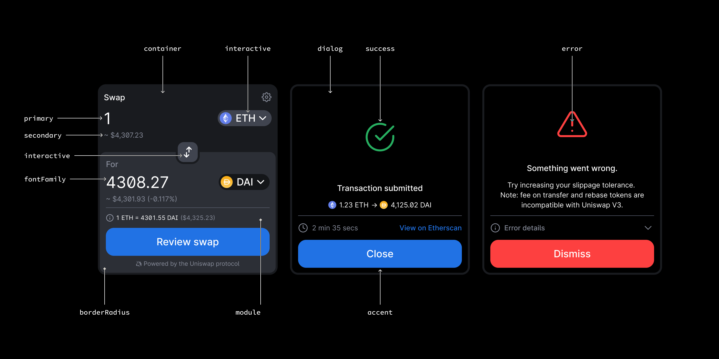
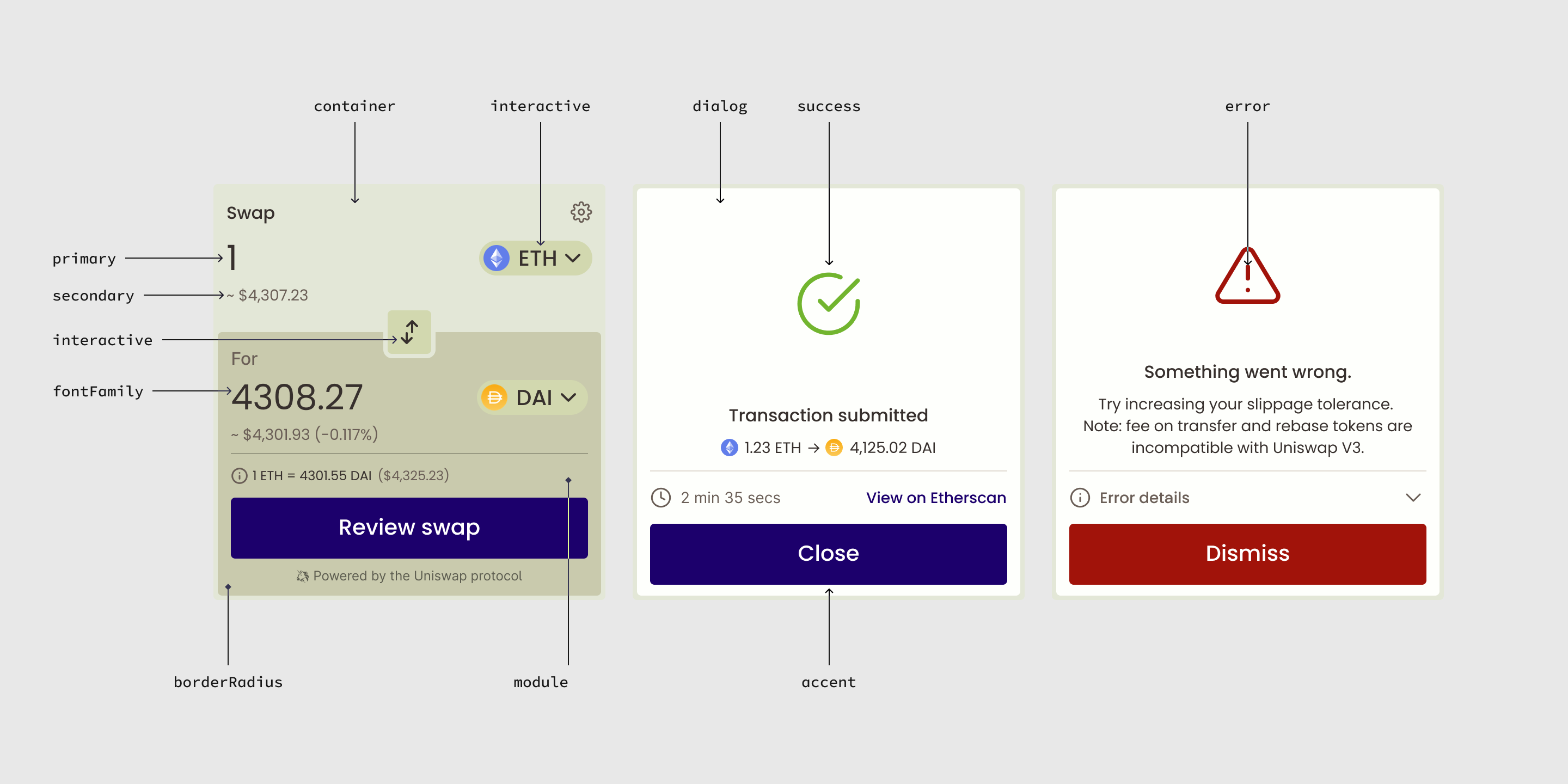
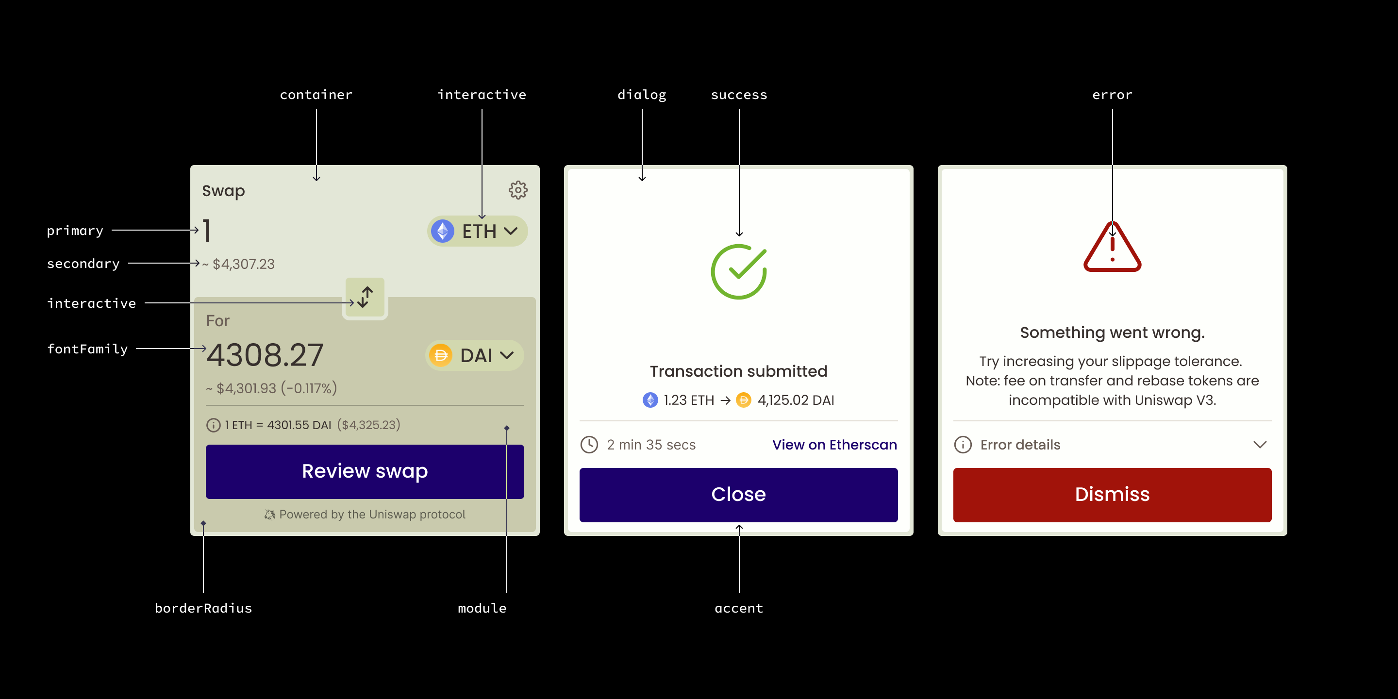
You can customize the colors, font, and border radius of the swap widget to match the look and feel of your dApp. You can also toggle between light and dark modes. This section explains how to customize each attribute of the widget with your own theme.
All attributes below are color codes, except fontFamily (string), borderRadius (number between 0 and 1), and tokenColorExtraction(boolean). The next two sections show code examples using these attributes.
Check out examples of the swap widget, and the Figma file if you want to mock it up first!
Overriding Attributes
You can override specific attributes of the widget by creating a Theme object and defining the properties you wish to override. Any properties left undefined will fallback to the default theme. For example, here is a simple Theme that removes the border radius and sets a custom font family.
import { Theme, SwapWidget } from '@uniswap/widgets'

// Define a custom theme to override default attributes
const theme: Theme = {
  borderRadius: 0,
  fontFamily: '"Helvetica"',
}

function App() {
  <div className="Uniswap">
    <SwapWidget theme={theme} />
  </div>
}
Please note that the borderRadius attribute is a multiplier from 0 to 1 of how much radius to apply. Since the widget uses different values of border radius (e.g. internal edges have tighter radii than external edges), borderRadius will apply your multiplier value on all instances so that the border radii still look proportionally correct.
Importing Fonts
The swap widget fonts must be imported explicitly with import '@uniswap/widgets/fonts.css'. However, if you’re overriding the swap widget fonts with your own, or with a default font such as Helvetica in the example above, you can remove this import statement.
Enabling Token Color Extraction
By default, the background color of the output module will be set by the module attribute. You can optionally enable color extraction to flood the output module with the color of the selected output token. In the above example, DAI is the output token so the output module is flooded with DAI yellow.
To enable color extraction, set the tokenColorExtraction property to true in your Theme object.
import { Theme, SwapWidget } from '@uniswap/widgets'
import '@uniswap/widgets/fonts.css'

const enableColorExtractionTheme: Theme = {
  tokenColorExtraction: true, // Enable color extraction of the output token
}

function App() {
  <div className="Uniswap">
    <SwapWidget theme={enableColorExtractionTheme} />
  </div>
}
Toggling Light and Dark Mode
The swap widget provides a default light theme and dark theme as a starting point. You can import each one and extend it to create your own theme. If your app can toggle between light and dark mode, you can propagate that state down to the widget by following the example below.
import { darkTheme, lightTheme, Theme, SwapWidget } from '@uniswap/widgets'
import '@uniswap/widgets/fonts.css'

let darkMode = true // Dynamically toggle dark mode on and off
function App() {
  <div className="Uniswap">
    <SwapWidget theme={darkMode ? darkTheme : lightTheme} />
  </div>
}
Matching System Preference for Light and Dark Mode
You can match the user’s system preference for light/dark mode by using the useSystemTheme hook. This will return the default widget light or dark theme according to the user’s system configuration. You can extend this base theme with further customizations, as you will see in the next section.
import { SwapWidget } from '@uniswap/widgets'
import '@uniswap/widgets/fonts.css'

function useSystemTheme() {
  // Access
}

function App() {
  const theme = useSystemTheme() // Get a theme that matches the user system preference
  <div className="Uniswap">
    <SwapWidget theme={theme} />
  </div>
}
Extending Themes
You can extend any theme with custom attributes. The below example extends the base light and dark themes with custom colors.
import { darkTheme, lightTheme, Theme, SwapWidget } from '@uniswap/widgets'
import '@uniswap/widgets/fonts.css'

const myLightTheme: Theme = {
  ...lightTheme, // Extend the lightTheme
  accent: '#FF007A',
  primary: '#000000',
  secondary: '#565A69',
}

const myDarkTheme: Theme = {
  ...darkTheme, // Extend the darkTheme
  accent: '#2172E5',
  primary: '#FFFFFF',
  secondary: '#888D9B',
}

let darkMode = true
function App() {
  <div className="Uniswap">
    <SwapWidget theme={darkMode ? myDarkTheme : myLightTheme} />
  </div>
}
Customizing the Token Lists
By default, the widget will use the Uniswap Labs default token list in the selector.
Customizing the Default Token List
If you want to offer a different set of tokens in the widget, you can provide a custom tokenList parameter. You can browse popular token lists to find one that suits your needs and then pass the URL as a parameter.
import { SwapWidget } from '@uniswap/widgets'
import '@uniswap/widgets/fonts.css'

const CMC_TOKEN_LIST = 'https://api.coinmarketcap.com/data-api/v3/uniswap/all.json'

function App() {
  <div className="Uniswap">
    <SwapWidget
      tokenList={CMC_TOKEN_LIST} // Use the CoinMarketCap token list
    />
  </div>
}
Alternatively, you can create your own token list. There are two ways to provide your own token list for the widget.
The first option is to create a full token list, host it at your own URI, and pass the URI as a parameter as in the above example. This option is recommended if you want to use the same token list in multiple places throughout your application or community.
The second and easiest option is to construct a custom token list inline as an array of tokens. The schema is equivalent to the tokens array from the tokenlist JSON schema. This option lets you skip deployment, hosting, and versioning of a full URI token list. Here is an example of an inline token list containing only the DAI, USDT, and USDC tokens (in addition to ETH which is always available, regardless of token list).
import { SwapWidget } from '@uniswap/widgets'
import '@uniswap/widgets/fonts.css'

// You can also pass a token list as JSON, as long as it matches the schema
const MY_TOKEN_LIST = [
    {
    "name": "Dai Stablecoin",
    "address": "0x6B175474E89094C44Da98b954EedeAC495271d0F",
    "symbol": "DAI",
    "decimals": 18,
    "chainId": 1,
    "logoURI": "https://raw.githubusercontent.com/trustwallet/assets/master/blockchains/ethereum/assets/0x6B175474E89094C44Da98b954EedeAC495271d0F/logo.png"
  },
    {
    "name": "Tether USD",
    "address": "0xdAC17F958D2ee523a2206206994597C13D831ec7",
    "symbol": "USDT",
    "decimals": 6,
    "chainId": 1,
    "logoURI": "https://raw.githubusercontent.com/trustwallet/assets/master/blockchains/ethereum/assets/0xdAC17F958D2ee523a2206206994597C13D831ec7/logo.png"
  },
  {
    "name": "USD Coin",
    "address": "0xA0b86991c6218b36c1d19D4a2e9Eb0cE3606eB48",
    "symbol": "USDC",
    "decimals": 6,
    "chainId": 1,
    "logoURI": "https://raw.githubusercontent.com/trustwallet/assets/master/blockchains/ethereum/assets/0xA0b86991c6218b36c1d19D4a2e9Eb0cE3606eB48/logo.png"
  },
]

function App() {
  <div className="Uniswap">
    <SwapWidget tokenList={MY_TOKEN_LIST} />
  </div>
}
Please note that the swap widget only enforces metadata validation on remotely hosted token lists, not on token list data passed as a literal value to the widget like in this example.
If you want to add Layer 2 tokens to the token list, you can add an extension field. See this GitHub issue for details.
Customizing the Default Input and Output Tokens
You can set the defaultInputTokenAddress, defaultInputAmount, defaultOutputTokenAddress, and defaultOutputAmount to pre-populate the input and output token fields respectively. This is useful when the widget appears in a context where you know which tokens the user is evaluating to trade. For example, if the widget appears on a page that displays the WBTC price chart, it would be helpful to pre-select WBTC as the output token in the widget.
If your page does not need any particular defaults, then the recommended default input token is the native asset of the active network (e.g. ETH) and no default output token is recommended. Since ETH does not have an address, you can pass 'NATIVE' as the parameter to set it as the default input or output token.
The following example sets the default input to 2 ETH and the default output token to WBTC.
import { SwapWidget } from '@uniswap/widgets'
import '@uniswap/widgets/fonts.css'

// Default token list from Uniswap
const UNISWAP_TOKEN_LIST = 'https://gateway.ipfs.io/ipns/tokens.uniswap.org'

// Use the native token of the connected chain as the default input token
const NATIVE = 'NATIVE' // Special address for native token

// WBTC as the default output token
const WBTC = '0x2260FAC5E5542a773Aa44fBCfeDf7C193bc2C599'

function App() {
  <div className="Uniswap">
    <SwapWidget
      tokenList={UNISWAP_TOKEN_LIST}
      defaultInputTokenAddress={NATIVE}
      defaultInputAmount={2}
      defaultOutputTokenAddress={WBTC}
    />
  </div>
}
Understanding the Swap Widget States
The widget has two main connectivity states depending on if the user has connected a wallet.
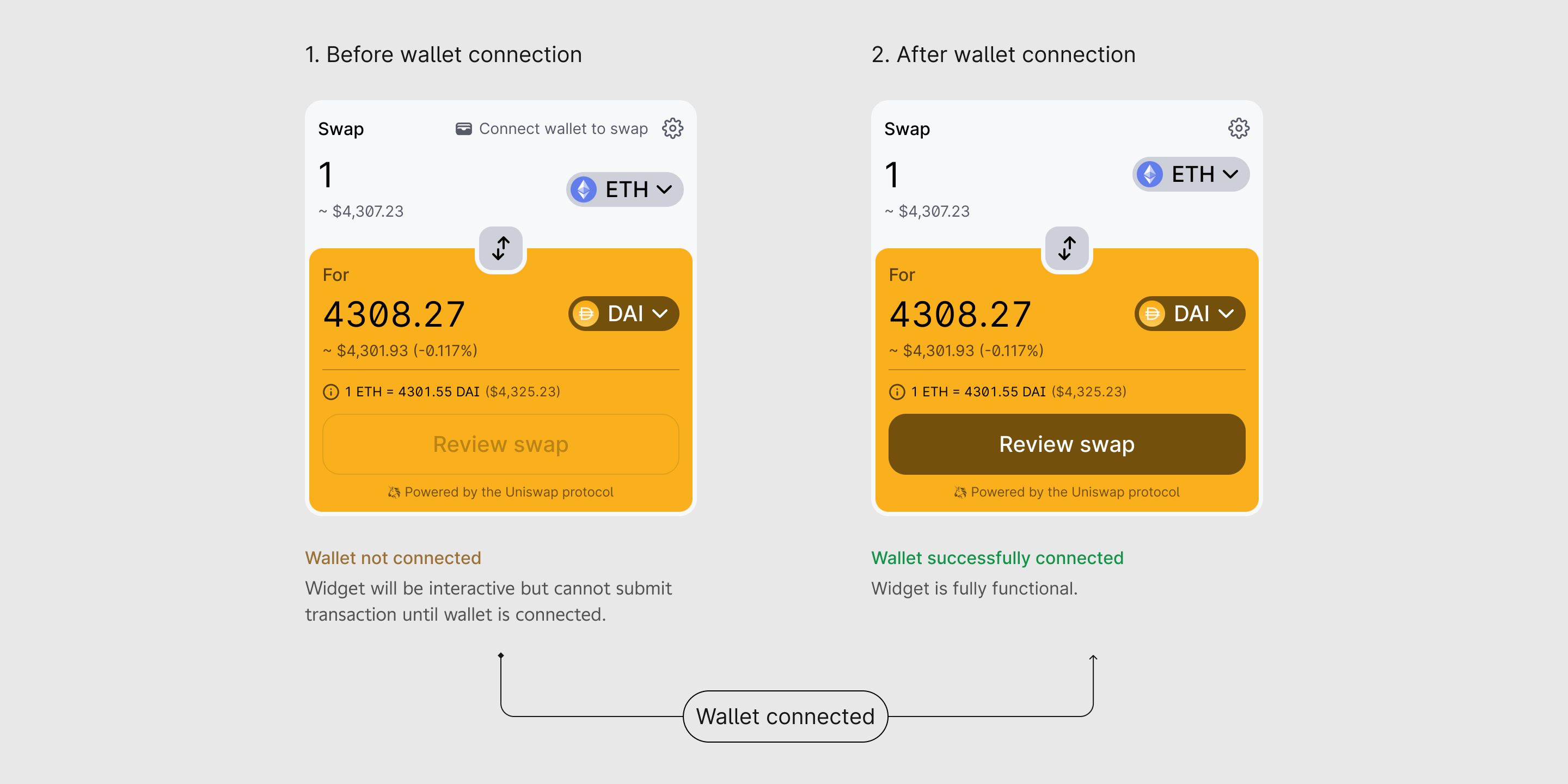
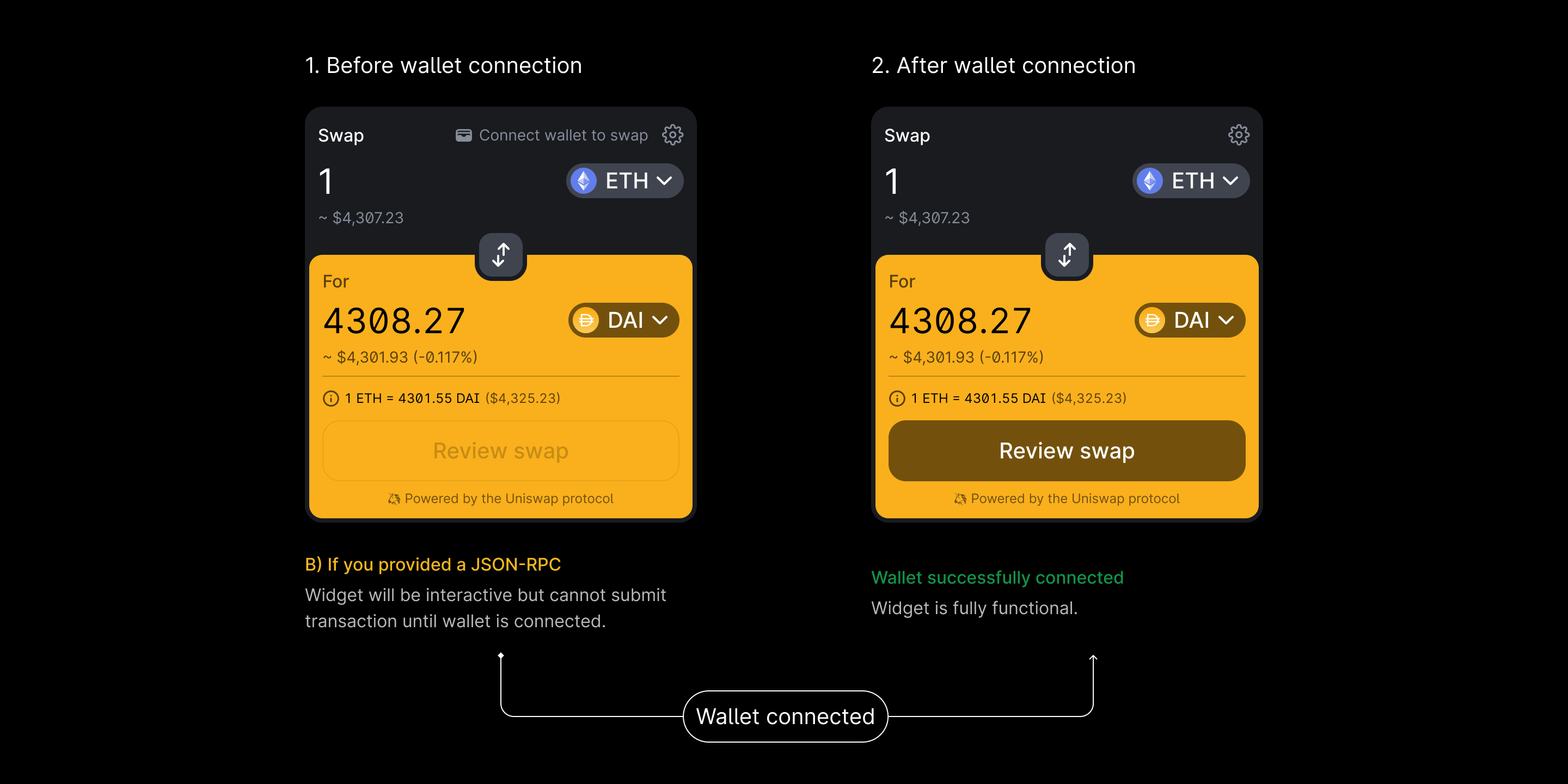
- Before wallet connection, the widget will use the JSON-RPC endpoint to fetch token price data and provide trade quotes, but submitting transactions will be disabled.
- After wallet connection, the widget will be fully functional. The user will be able to fetch trade quotes and submit swap transactions using the JSON-RPC endpoint and web3 provider from their connected wallet.
Questions?
Join the Discord channel to ask questions and get support from the Uniswap community.